

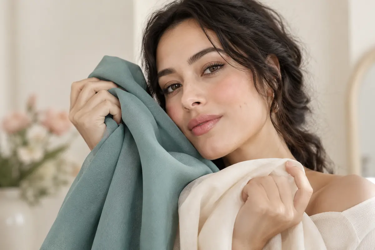
Find colours for olive skin by comparing shades on yourself with a clear aim: softness, contrast or a visible colour statement. Start with clothes you own. Compare cream with white, plum with bright pink, and teal with pale blue. Keep combinations that deliver the effect you want.
No colour list applies to every olive complexion. Sage might suit a soft outfit but feel insufficiently bold to someone seeking strong contrast. Coral might appeal as a sheer lip colour and feel too prominent as a bright top. Placement, finish and your intention matter.
If the olive label is uncertain, read how to recognise an olive undertone. You can still start clothing comparisons without settling on a category first.
Decide what “suits me” means for this outfit
Before opening a palette, choose the result. Do you want the face to be the first thing people notice? A quiet work look? Bright lips with calm clothing? Strong contrast for an evening outfit?
Different aims can produce different winners. A cream top and a fuchsia top can both be successful. One creates a subtle transition; the other makes the colour a deliberate focal point.
Separate colour from fit and fabric too. Comparing a beautifully fitted blue shirt with a stretched yellow jumper can make colour take the blame for a shape or texture issue. Two scarves in a similar material make a cleaner comparison.
Our broader guide to colours that suit you applies this method across the wardrobe. Here, the comparisons focus on common questions about olive complexions.
Use two fabrics and repeat the conditions
Stand in indirect daylight against a quiet background. Keep hair, jewellery and makeup the same through each comparison. Changing lipstick between every photograph makes it harder to understand what the fabric did.
Hold one fabric beneath your face, then the other at the same height. Look from a normal distance. Record three observations: how present your face feels, whether you like the contrast, and how much attention the garment takes. You do not need to search for skin flaws to make the decision.
When practical, check in the lighting where you will wear the outfit. A preference can change in an evening room. Photos help you remember combinations, but phone processing stops them from being an exact colour judge.
If the result is unclear, wear each option as a complete outfit for a few minutes. Comfort, familiarity and your preferred level of attention are part of a real clothing decision.
Starting comparisons that answer different questions
| Colour family | Two versions to try | What you are comparing |
|---|---|---|
| White | Clear white / soft cream | Strong contrast or a gentler transition |
| Blue | Deep teal / pale blue | Depth or lightness beside the face |
| Pink | Bright pink / rose-brown | A visible accent or quieter colour |
| Green | Muted sage / deep green | Softness or stronger contrast |
| Yellow | Lemon / mustard | Bright lightness or a more muted warmth |
| Red | Clear red / burgundy | A bright or deep focal point |
These are exercises, not predictions. If pale blue wins, keep pale blue. If neither option appeals, try an intermediate version. The particular shade can matter more than the family name.
“I prefer muted colours beside my face” is a useful personal shopping rule. “Olive skin must avoid pink” does not follow from your comparison and would unnecessarily narrow someone else's choices.
Keep a colour you love by changing its position
Before excluding a shade, try it elsewhere. A yellow you enjoy can become trousers, a skirt or a bag. A familiar colour near the face may make the combination feel easier to wear.
Change the proportion too. Try a small coral print instead of an entirely coral top, or an open jacket instead of a high-neck dress. Neckline and the amount of visible skin alter how much colour frames the face.
For a scarf or hijab, compare material as well as hue. A shiny fabric and a matte one in the same colour family produce different impressions. Test off-white and clear white with the complete outfit, then choose the result you prefer.
The outfit colour combinations guide helps move from one fabric to an outfit. A colour you love can earn a place without requiring a replacement wardrobe.
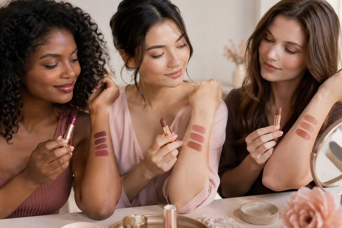
Choose nude lipstick from your lips, not a universal label
A nude shade is relative to your mouth and the result you want. A beige sold as universal can be much lighter than your natural lips. In an opaque formula, that can create a contrast you did not intend.
Compare three similarly deep families: rose-brown, pink-brown and peach-beige. Try them on the lips with your usual makeup. A hand swatch helps you inspect the product, but cannot show exactly how it combines with your lip colour.
Choose a sheer option when you want natural lip colour to remain visible. Compare an opaque version when you want a defined result. If your lips are pigmented or have more than one natural shade, judge the whole mouth after application.
The lipstick guide for your skin tone explores that choice further. An undertone hypothesis cannot replace seeing the actual lip result.
Organise red, coral and plum trials by intention
Compare one pair for each aim. For bright lips, try a more orange-red and a more blue-red at similar depths. For a deeper statement, compare plum with burgundy. For a light accent, compare sheer coral with sheer pink.
Keep your top and base makeup consistent. A foundation that looks too pink or orange can influence your impression of a lipstick. The foundation guide for olive skin helps resolve that mismatch before you buy more lip shades.
You may prefer a high-contrast red even when it looks less natural. That is a valid result. The purpose is to choose how visible the colour should be, not make every part of your outfit disappear.
Build a small palette you will actually use
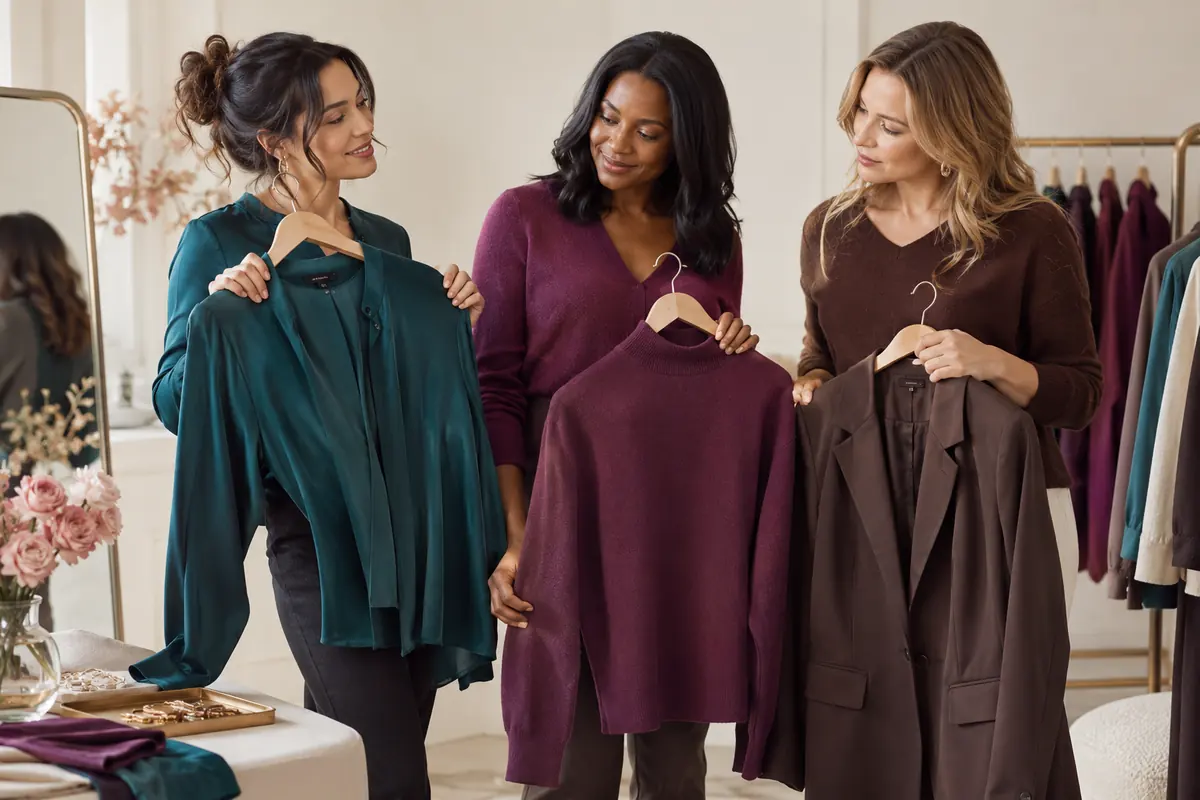
After the comparisons, choose two neutrals, two clothing colours and two lip colours. Write down specific descriptions such as “cream without a strong yellow cast,” “deep teal” and “sheer rose-brown.” They are easier to shop from than an imposed seasonal label.
Give each colour an outfit from your existing wardrobe, then try one new combination. The capsule wardrobe from your own closet guide helps turn observations into repeatable outfits.
Hair colour is a separate choice with maintenance and salon constraints. Use hair colour for olive skin for that decision. The undertone guide supplies broader vocabulary if you need it.
Your palette can change with your taste, makeup and occasions. Keep the comparisons that helped, then expand it one colour at a time.
Frequently asked
What colours should I try for olive skin?
Teal, plum, burgundy, browns and off-whites can be useful starting comparisons. Try their lighter, brighter and cooler versions as well. Your complexion depth, desired contrast and taste matter more than a universal colour list.
Can olive skin wear yellow and green?
Yes. Compare lemon with mustard or sage with a deeper green. If you like a colour less beside your face, try it in trousers, a skirt or an accessory and choose a top you prefer near the face.
How do I choose a nude lipstick for olive skin?
Start from your natural lip colour and the depth you want. Compare rose-brown, pink-brown and peach-beige at similar depths. Sheer and opaque finishes can look quite different despite sharing a shade name.
Does olive skin belong to one colour-analysis season?
No. Olive alone does not establish a season. It does not describe your overall depth, contrast or preference for clear versus muted colours. You can build a useful palette without choosing a seasonal label.
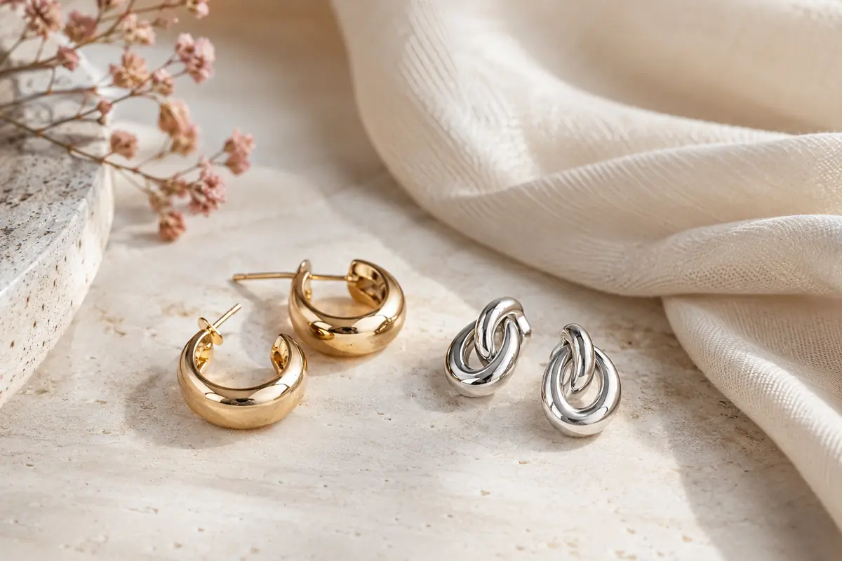
Should olive skin wear gold or silver jewellery?
You can wear either. Compare shine, size and finish alongside the outfit too. A metal you enjoy wearing does not prove your undertone; it is a styling choice that can change with the combination.