

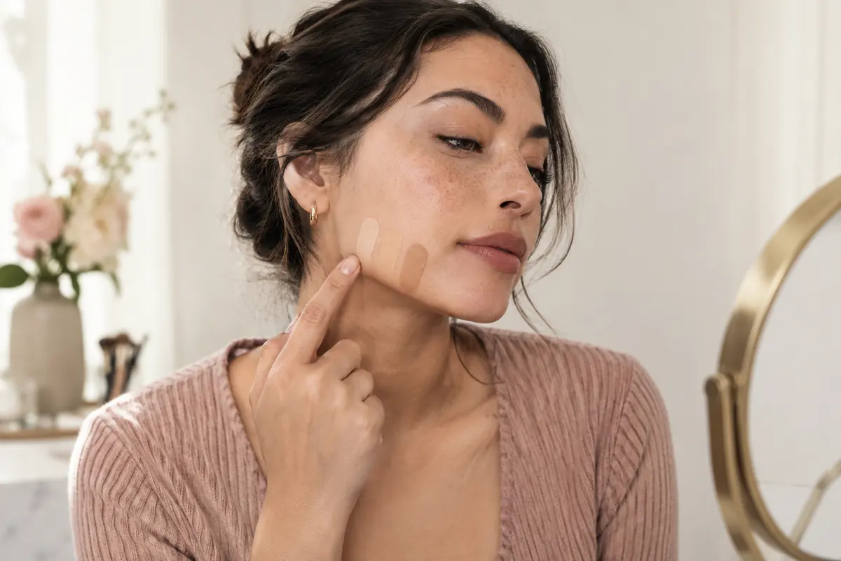
For olive skin, compare foundation shades at the same depth and judge their colour after the formula has settled. An olive, a neutral-olive and a neutral shade make a practical shortlist. The strongest match creates the least noticeable transition between the lower face and the visible neck.
There is no single foundation that will suit every olive complexion. What helps is recognising why a sample failed and choosing the next variable to change. If olive is still a guess, start with how to recognise an olive undertone, then return with two or three samples.
Build a shortlist that compares like with like
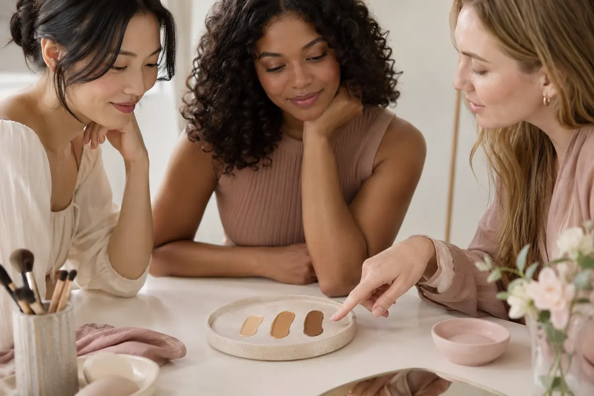
Warm, neutral and olive labels are not standardised across brands. Read the full shade description and look at real samples. A neutral in one range can look much peachier than a neutral in another.
First narrow the selection to a plausible depth: fair, light, medium, deep or an available step between them. Then compare undertones within that depth. If every olive option is too deep, do not choose one simply to satisfy the label. Try a less rosy neutral or another range.
Ask for samples where available and record the formula as well as its shade number. Two products from the same brand may differ in coverage, finish and colour appearance. A code you like is not a guarantee across formulas.
Use your usual skincare for the actual wear trial and let it settle before applying makeup. If a texture pills or catches on dry areas, it can distract from colour judgement. Evaluate the texture separately instead of assuming a poor finish means a wrong undertone.
Swatch the jaw, then test a larger patch
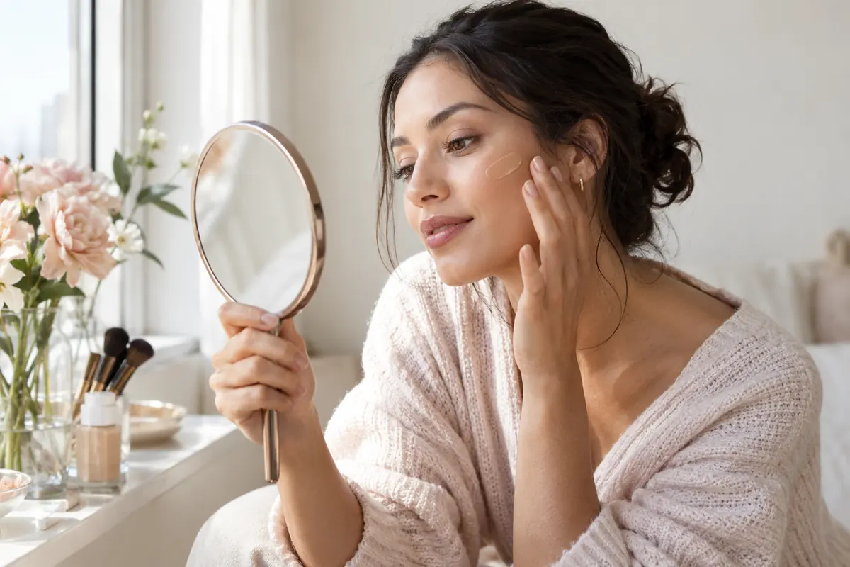
Apply three thin stripes across the lower cheek and jaw. Leave a small defined section to see the hue and blend the other edge. Your hand can tell you something about texture, but cannot settle the face-to-neck transition.
The official MAC matching guide also recommends checking that the shade blends into the jawline without looking too light or dark. That supports the comparison method; it does not establish that a particular product range will suit you.
- Examine the stripes in indirect daylight, without a yellow lamp changing one side.
- Identify candidates that are too light or too deep first.
- Compare the remaining hues: pink, peach, yellow or greyish.
- Let the formula settle according to its instructions. A check around ten minutes can be a practical checkpoint, rather than a universal waiting rule.
- Try the best candidate on a larger facial area and check again after a realistic period of wear.
For an open neckline, consider the upper chest as well. If face and neck differ, choose the transition you find most coherent and look from a normal conversational distance. A thick stripe examined extremely close to a mirror does not recreate how you will wear the product.
Read the mismatch before replacing the bottle
| What you see | What to check first | Useful next comparison |
|---|---|---|
| A pink or peach stripe | Is the depth otherwise right? | A less rosy shade at a similar depth |
| Orange from the first application | Is it too deep or too peach? | An adjusted depth or less peach candidate |
| A good initial match that changes when settled | Same lighting, amount and preparation? | A wear trial, then another formula if needed |
| Grey or chalky coverage | Too light or too much product? | Correct depth, then a less greyish undertone |
| A strong yellow veil | Is the product adding more yellow than wanted? | Neutral-olive or a less golden olive |
Change one variable at a time. Replacing a pale pink sheer product with a deep golden full-coverage one tells you little about which change made the difference.
Orange later in the day: record the change accurately
“It oxidised” has become a catch-all explanation for colour changes. You cannot determine the mechanism from the mirror alone. Drying, finish, preparation, product amount and lighting can all affect what you observe.
Record the result immediately, once settled and later, at the same location. If the mismatch exists in the first stripe, start by comparing another shade. If it emerges later, repeat the trial with your usual routine and a realistic amount of product.
Buying deliberately too light is not an automatic answer. The shade might remain too light and create a different mismatch. If the formula changes more than you like, compare another formula before buying several products to compensate.
The general foundation matching guide expands the shopping method. Keep the undertone guide nearby if you need the starting vocabulary.
Use shade adjusters as a small experiment
A cosmetic adjuster can help with a minor mismatch when it is designed for the intended use. Read both products' instructions. Do not substitute craft pigment or a cosmetic intended only for another area of the face.
Take a small portion of foundation separately, add a minimal amount of an appropriate adjuster and compare it with the unmodified product. Record the mixture so you can repeat it. Avoid experimenting in the whole bottle.
Green corrector is not automatically the answer to orange foundation. It can leave a mixture too greyish or alter opacity. If depth is the main issue, fix depth first. If matching demands multiple products every morning, another shade or range may be easier.
Check the finished face before choosing
A shade can blend well in a thin layer and become more obvious at fuller coverage. Recreate your intended use: a daily veil, targeted coverage or an occasion look. Apply the amount you would actually wear.
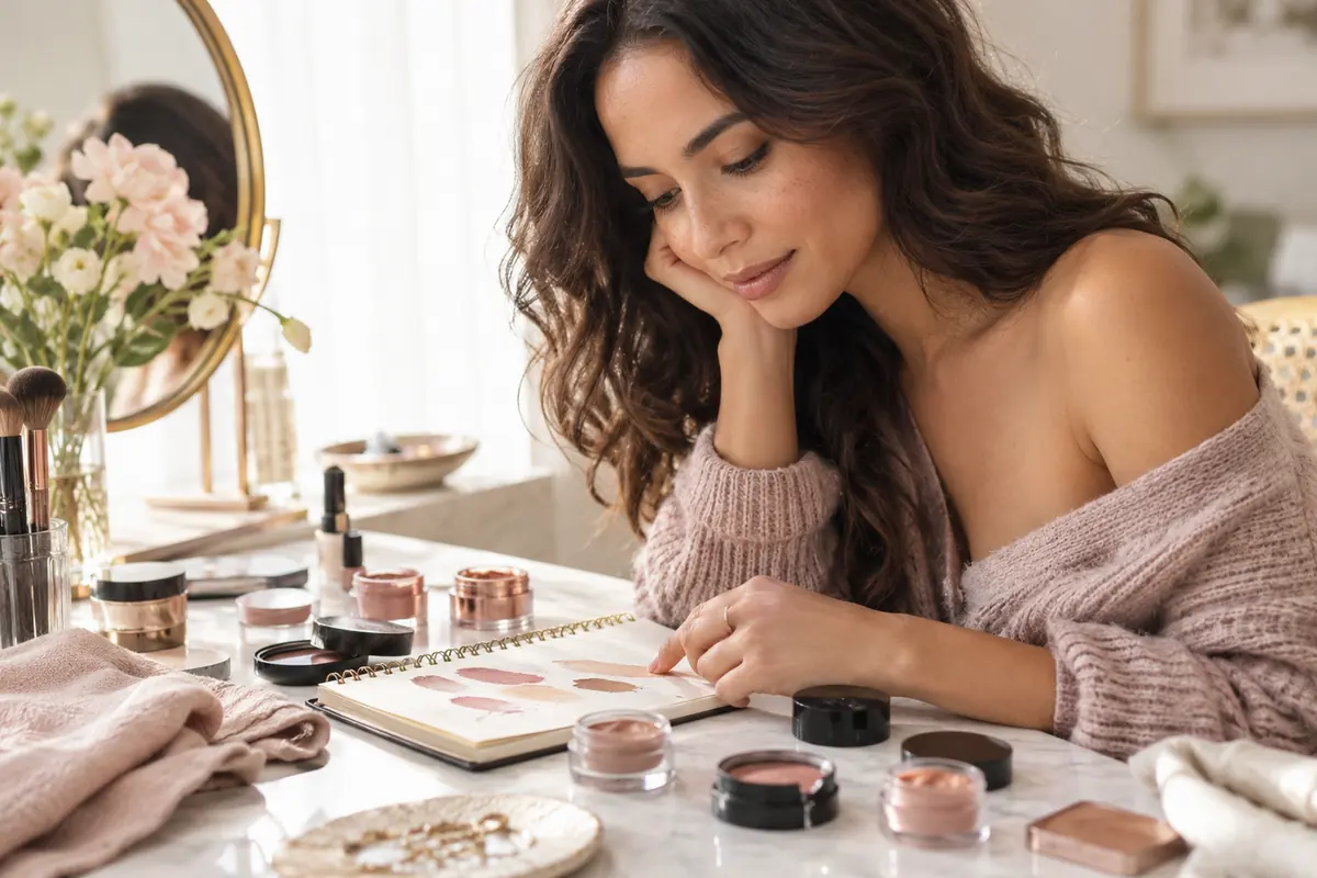
Test your regular powder on part of the trial too. A tinted powder can change the finished colour. Add blush and bronzer afterwards so you can judge the base without compensation. Lipstick changes the overall impression; lipstick for your skin tone helps with that separate selection.
Your useful shopping note is specific: “correct depth, less peach than my old formula, discreet transition once settled, comfortable with my skincare.” That is more actionable than insisting on an olive-warm category regardless of the sample.
Keep the shortlisted formula for a second trial if you are uncertain, and check it under the lighting in which you usually wear makeup. You are allowed to choose a close, comfortable match over an elaborate mixture that is difficult to reproduce.
For the rest of the look, compare clothing and lip colours for olive skin. For a salon decision, use hair colour for olive skin. A good base helps you see those choices clearly without prescribing a single palette.
Frequently asked
Which foundation undertone should I try for olive skin?
Start with olive or neutral-olive at a depth close to your complexion and compare it with a neutral shade. Some people will prefer slightly more yellow, others less. The label is a sampling clue; the blended jawline swatch makes the decision.
Why does foundation look orange on my olive skin?
It may be too peach or orange, too deep, or look different after drying. Compare it immediately and once settled in the same lighting. An orange mismatch does not automatically establish oxidation.
Why can an olive foundation look grey?
It may be too light, too muted for your complexion or applied with more coverage than you need. Check depth first, then compare a slightly more golden or less grey shade at the same depth. Adding more bronzer does not necessarily fix the base match.
Can I mix green corrector into foundation?
Only use a cosmetic product designed for the intended mixing use, following its instructions. Test a tiny amount in a separate portion rather than in the bottle. Mixing can change colour and finish; green corrector does not automatically make every foundation suitable for olive skin.
Should I buy a lighter foundation to allow for colour change?
Not automatically. Judge the settled product and a realistic wear trial. If the best shade changes too much to suit you, compare another formula rather than routinely buying a shade that starts too light.