

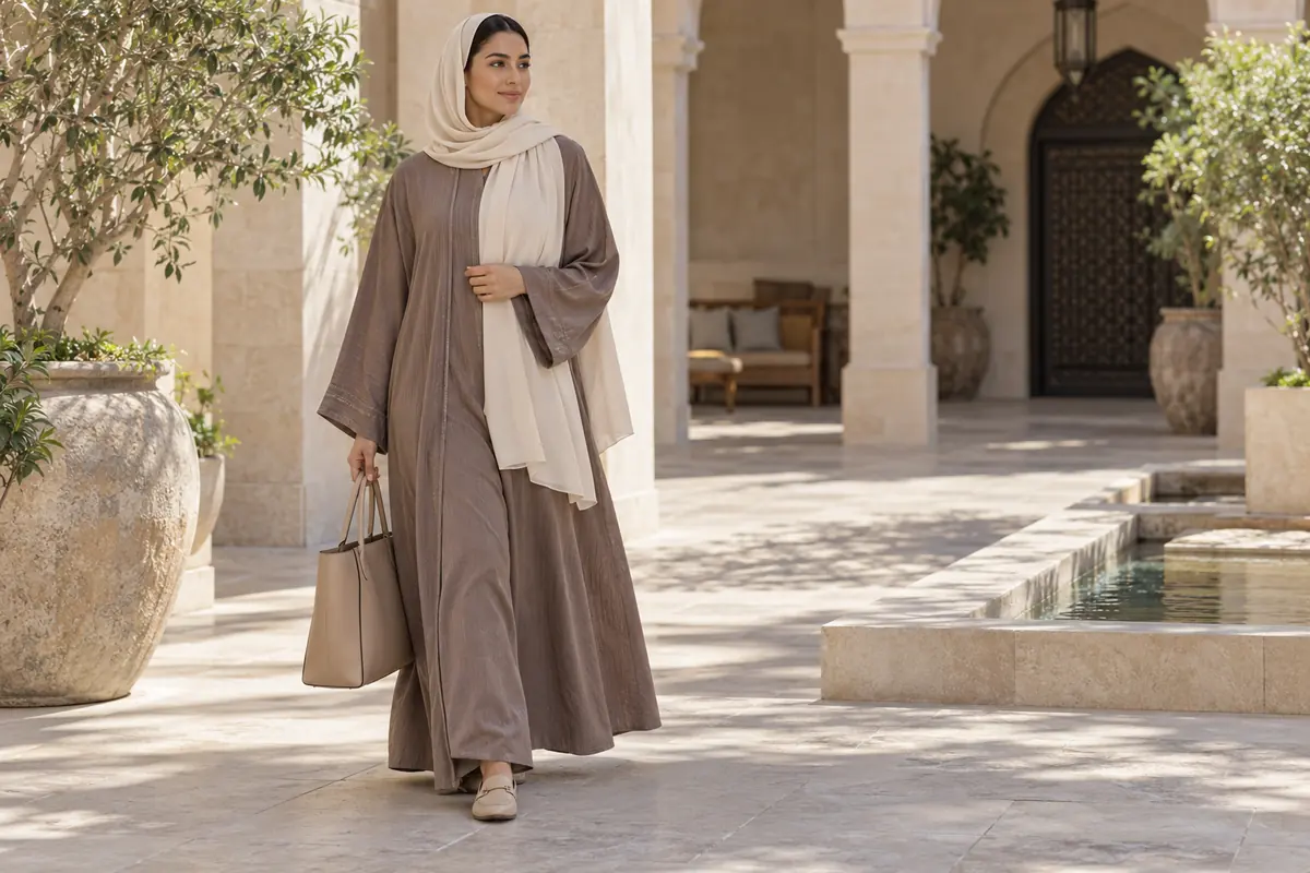
Start with the garment you want to wear, then assign the other colours a job. Pick the abaya or outer layer first. Choose a supporting scarf or underlayer, then decide whether you want an accent. This is easier to test than searching for a palette that is supposedly correct for every Gulf woman.
Colour can express a quiet mood, visible contrast or a favourite detail. These are preferences, not measurements of beauty. The examples below are original styling suggestions; they do not claim to be national dress codes, current trend rankings or formulas determined by your skin tone.
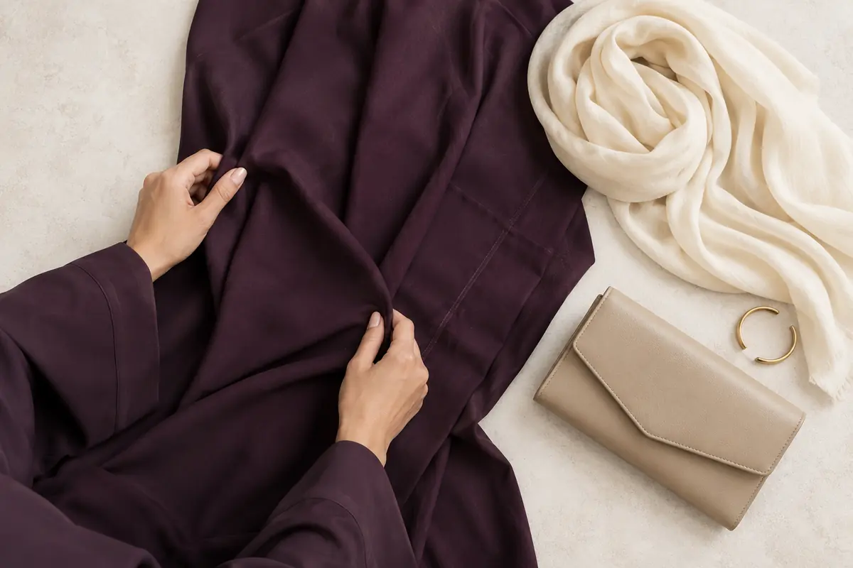
Try plum with a quiet neutral base
Place a plum abaya beside an ivory, taupe or muted grey scarf you already own. Try one at a time. Look at the full outfit rather than judging two swatches in isolation, because the largest garment and the scarf near the face occupy different areas.
For a daytime version, try plum outerwear, a comfortable neutral underlayer, quiet shoes and a bag you already use. For a gathering, keep the palette and compare one small reflective detail. Do not assume ivory fabric is opaque; test the layer you intend to wear.
If the neutrals look unrelated, choose what to change. You might repeat one neutral in the bag, use a more visibly contrasting scarf or keep the difference deliberately. “Everything must match” is not the only way to produce an intentional outfit.
Try teal with a restrained copper-toned detail
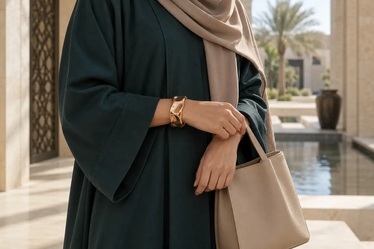
A teal garment can be the main colour, with a muted scarf and one copper-toned detail in a bag fitting or other accessory. This is an example to compare, not a claim that teal and copper suit every complexion or occasion.
Lay the accessory beside the cloth before wearing it. Then check scale: a small fitting creates a different effect from a large decorated cuff. If both the scarf and accessory compete with the teal, remove one strong detail and compare the result.
Test movement as well as colour. A bracelet that catches the sleeve is not useful because its tone is attractive. If the metal detail cannot work comfortably, put the colour elsewhere, such as a small bag detail, or leave it out.
Try charcoal and muted rose as a softer contrast
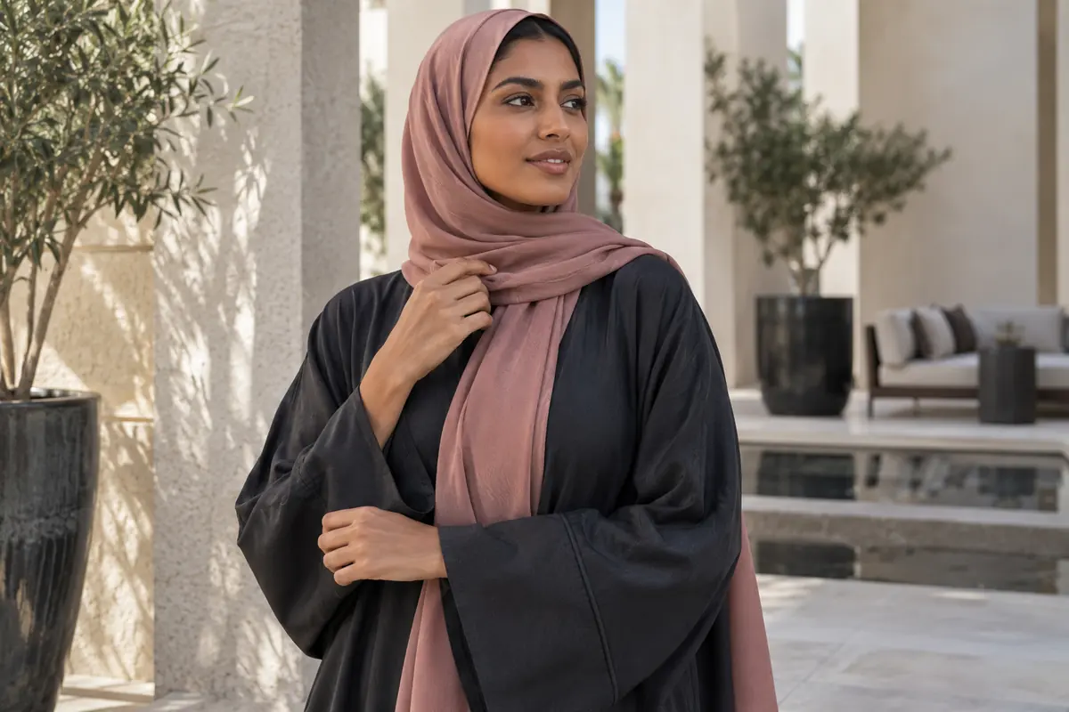
Compare a charcoal abaya with a dusty-rose scarf, keeping the underlayer and footwear simple. You can also reverse the emphasis by using a rose outer layer and charcoal smaller pieces, if those are clothes you own and enjoy.
Look at contrast rather than labeling the result universally “soft” or “feminine.” One person may experience the pairing as quiet; another may find the scarf too prominent. The useful question is whether the difference is as visible as you want.
If a portrait image inspires you, examine what is doing the work: colour area, scarf folds, light or a contrasting background. Recreate only the parts that serve your actual outfit. A photograph does not establish how the real fabric feels or how the garment will move.
Compare fabrics in daylight and room light
Put the actual pieces beside each other near a window, then under your usual lamp. Some apparent colour matches change with illumination: X-Rite's explanation. Your check is practical observation, not a laboratory identification of the cause.
Keep the fabric position reasonably similar between comparisons. Look first without a phone. A photo without filters can help record what you chose, but exposure and the screen may still alter appearance. Do not reject clothes solely because a retailer's image and your screen seem different.
If your venue uses warm interior light, make a second comparison in a reasonably similar available setting. You do not need to buy measuring equipment. Decide whether a difference matters to you and choose a contrast that remains enjoyable.
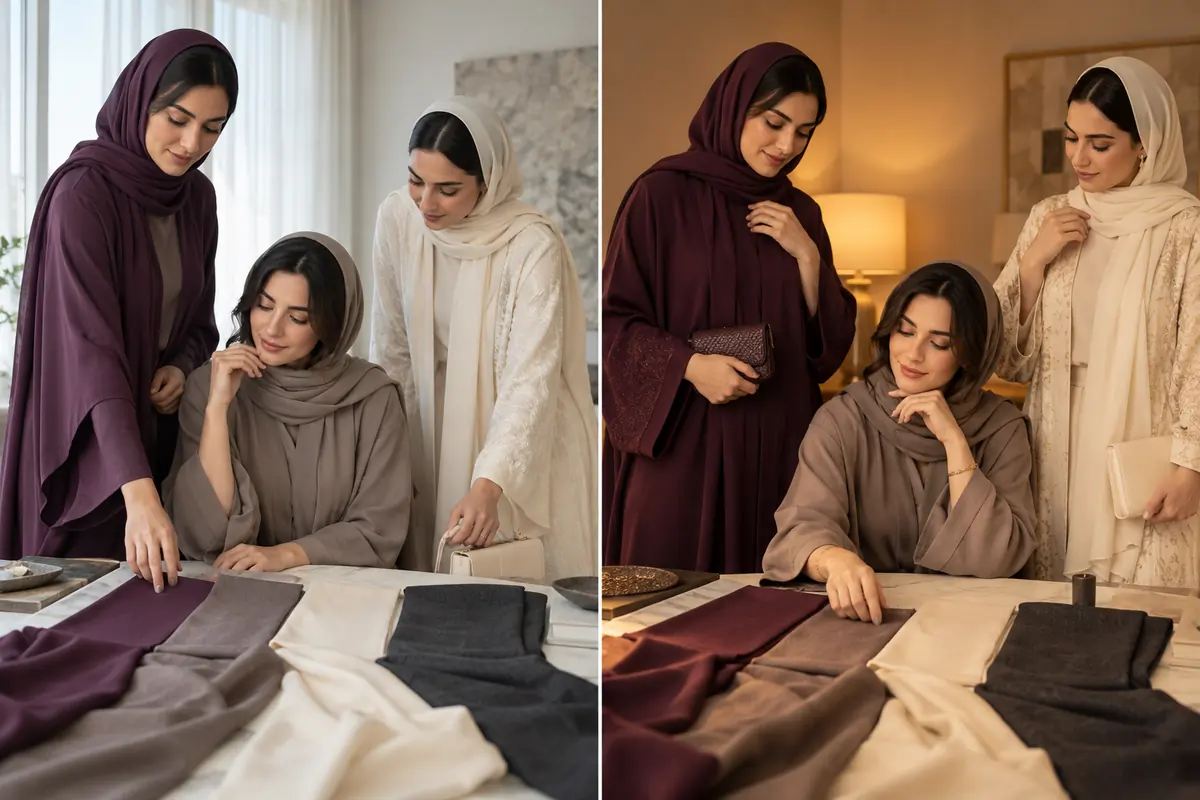
Select the amount of contrast deliberately
| Your aim | Starting combination | What to test |
|---|---|---|
| Close-toned and quiet | Similar muted colours in different surfaces | Whether details remain visible enough |
| One clear accent | Calm large garment plus a smaller stronger colour | Whether another accessory competes |
| A darker base with a lighter scarf | Charcoal or black with a chosen light neutral | Actual fabric coverage and light |
| A rich main colour | Plum or teal with quieter support pieces | Scale of ornament and daily usefulness |
| Reuse existing pieces | One scarf across two outer garments | Real lighting and workable footwear |
These starting points can be accepted, altered or rejected. They do not describe the worth of your complexion or require an undertone label. If a colour you like sits outside an online palette, compare it directly rather than treating the palette as a ban.
Which scarf with a coloured or printed abaya? Compare three candidates
Choose one existing scarf that repeats a visible garment colour, one quieter neutral and one deliberately contrasting option. Test each with the same abaya, bag and light. Let a repeat, support or accent be a choice you can see, rather than treating every combination as matching or wrong.
For a printed garment, first decide which printed colour you actually want to repeat; it need not be the smallest decorative detail. Look at the folded scarf as worn, because a print laid completely flat occupies a different visible area.
| Your specific difficulty | First experiment | Next decision |
|---|---|---|
| You want less visual competition | Replace only the stronger scarf with a quieter existing one | Keep the print or accessory you wanted to feature |
| Two near colours look unintentionally different | Compare a clearly contrasting scarf | Choose deliberate contrast or keep the near match if you like it |
| Plain clothes seem indistinct in a photo | Compare one texture change before a new colour | Check in person as well as on screen |
| You want one scarf for two abayas | Test both outfits with the actual folded scarf | Buy only if it works with both arrangements |
Buying several items all called beige does not confirm a shared shade. Nor does a face filter show the actual colour relationship. Save the exact combination and the light you checked, then repeat it before deciding another purchase is necessary.
Build three useful combinations before shopping
Take three outer garments you wear regularly and one or two existing scarves for each. Pair them on a rail or bed with shoes and a bag that actually work. Record only the combinations you are willing to wear.
Give each combination an activity: desk work, walking errands or a gathering. A visually pleasing palette with an unusable hem or bag is not complete. Confirm the movement and coverage requirements first, then save the colours as a repeatable option.
If a gap remains, define its job before looking for a product: “a scarf that works with these two garments and this neckline,” for example. This is more concrete than buying another item because it was described as a beauty secret. Check care needs as part of the decision, not after purchase.
Use labels and deliberate care, rather than colour myths
Read the garment's care label before treatment: GINETEX reference. A muted or dark colour does not identify the permitted washing, drying or ironing method. Do not improvise a stain treatment right before the event.
Keep sample outfit photos unfiltered and name the pieces you used. If you change a scarf or outer layer later, compare it again; a matching name such as “taupe” is not proof of identical colour across different sellers.
A hypothetical palette edit
Hypothetical example: Hessa wants to use a teal abaya she already loves. Her first arrangement includes a bright scarf, a decorated bag and a large copper-toned bracelet. She tries a quieter scarf and leaves the bracelet out because it catches the cuff. The small bag fitting becomes the only metallic detail.
The second option serves her goal of making the teal garment visible. It is not more Gulf, more expensive-looking or inherently better than a deliberately colourful mix. Her success is a combination she likes and can use.
Continue with the part that still needs work
Check abaya fit and movement, black abaya textures, sheila draping and Gulf workwear formulas. Explore outfit colour combinations and a closet-based capsule. The Gulf style hub connects colour ideas to practical outfit checks.
Frequently asked
What scarf colour should I choose with a coloured or printed abaya?
Compare three existing candidates: one repeating a visible garment colour, one quieter neutral and one clear contrast. Keep the abaya, bag and light the same and examine the scarf folded as worn. Choose the relationship you prefer; a region or skin-tone label does not decide it for you.
Must every accessory match the abaya?
No. You can repeat a tone, choose a visible contrast or let one item be an accent. Compare the complete outfit and give each color a deliberate role.
How do I use a bright color without changing my whole wardrobe?
Try it in one small area with a base you already wear, such as a scarf, bag or visible detail. Test a second version without it so you can see what it adds.
Can a phone photo prove two colors match?
No. Lighting, exposure and filters can change the appearance. Use photographs to remember an outfit, then compare the actual pieces in more than one light.
Is color analysis required to choose an abaya?
No. A palette system can be an optional vocabulary, but it is not a requirement or a verdict on your skin. Your real-life preference and the garment combination can guide the decision.